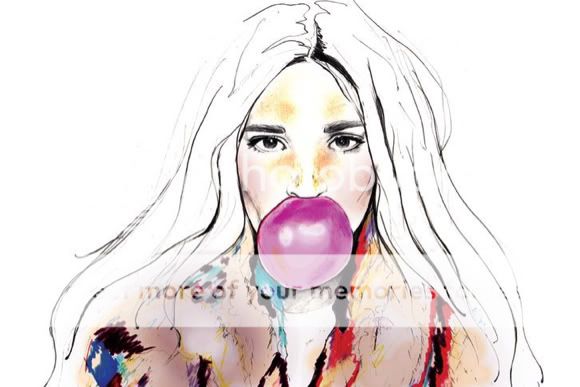
Sarah Hankinson’s work tends to be created using the media pencil and watercolour. She uses a lot of shading to make the illustrations seem real. Sarah focus’s her illustrations on bodies and faces. Her work is of mixed emotions, with some aspects the total opposite the he other in the illustration. She creates the moods by using plain facial expressions with a high fashion pose, which seem to look quite dark. Although the watercolour she uses brings a happy mood to her work; I think that she mixes the emotion in the illustrations up to get the viewer confused. My favourite aspect of Sarah’s work is how she uses the watercolour; she never paints the full illustration in. It gives he illusion of being rebellious, not finishing what needs to be done and moving on the something new. After looking at Sarah’s work I have experimented with this technique in my sketchbook; I think that I can reinvent her work with ease. Our working styles are similar which is what attracted me to her as an artists, I feel I can relate to her drawings. In her illustrations there seems to be a story behind each one, or at least based on a photograph or memory. My favourite image is based on a photograph by ‘she is frank’, which she turned into an illustration using water colours and shading, the illustration has so much frustration and anger hidden inside. The girl looks like she is being forced to become pretty but is rebelling against it. Her work consists of an unfinished look of her illustrations and the uses of colours are aimed at the high street. I could see one of her illustrations being an advertisement for make up.


No comments:
Post a Comment